$129.00
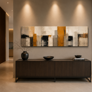
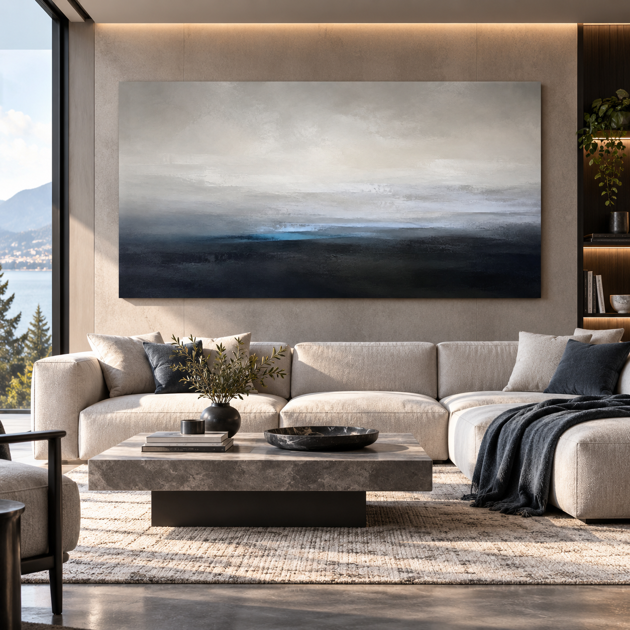
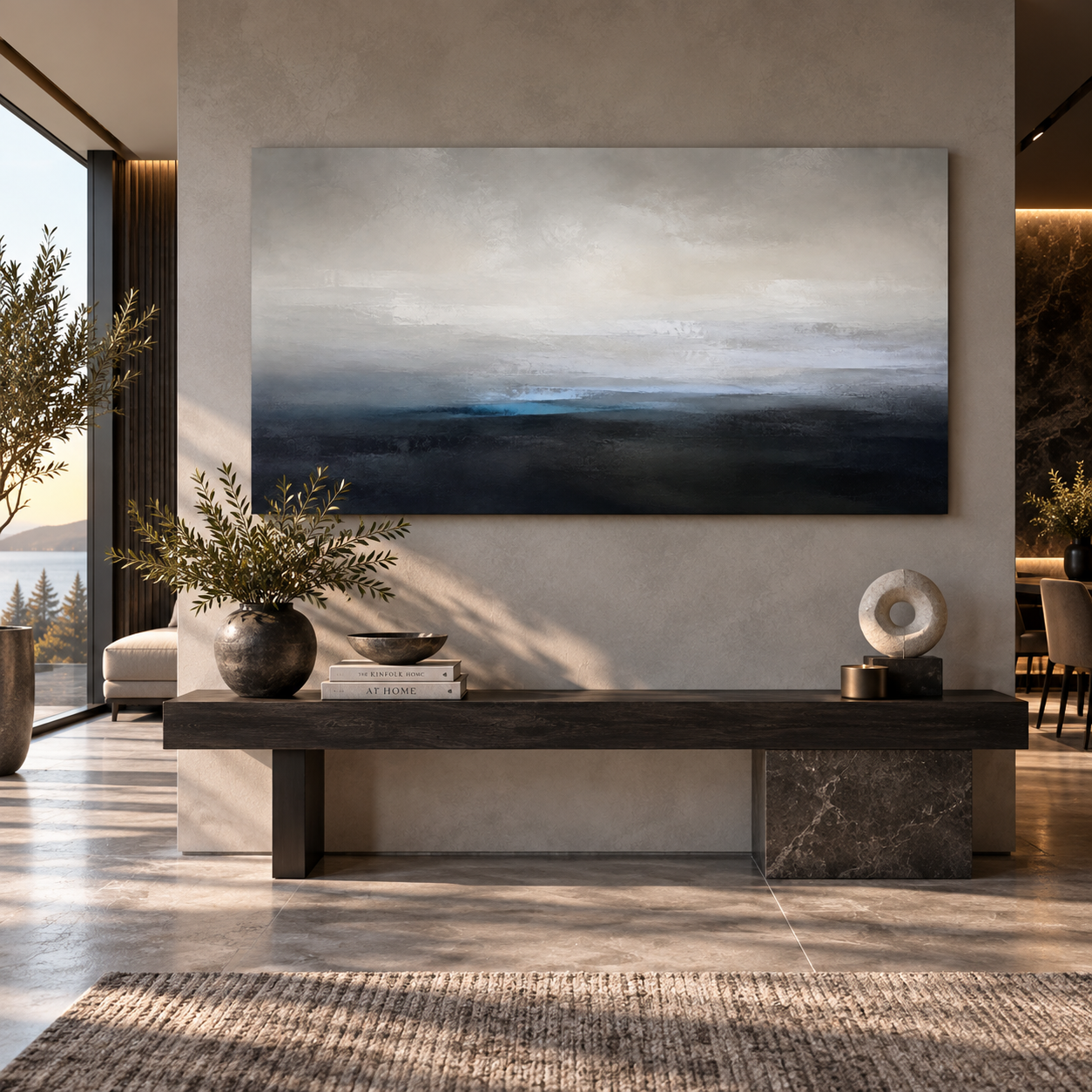
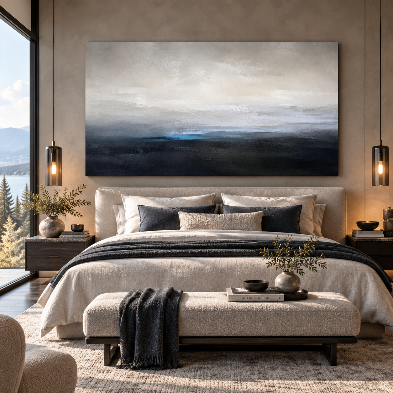
Quiet Frequency is a premium Modern Paradox canvas created for the December New Release collection. Minimal panoramic bands of fog grey, pearl and deep ink with subtle tactile grain. Designed in Canada with a refined, room-ready composition for contemporary homes and offices.
On orders $199+
Hassle-free returns
Encrypted & safe
Handcrafted in Canada using premium materials for lasting beauty and timeless appeal.
Quiet frequency canvas art creates a restrained panoramic composition through horizontal bands of fog grey, pearl and deep ink. Subtle shifts in tone establish a measured visual rhythm, while fine tactile grain gives the quieter surfaces greater depth.
Fog grey provides the atmospheric foundation. Pearl introduces softened areas of light, while deep ink creates the strongest visual weight. Rather than relying on bright colour, the artwork builds contrast through changes in value, texture and spacing.
From across the room, the long horizontal bands create a calm sense of movement. Closer viewing reveals surface grain, softened transitions and subtle variations within the neutral fields.
Horizontal layers travel across the panoramic composition with controlled changes in width and tonal density. Their restrained arrangement creates movement without relying on dramatic shapes or sharp colour shifts.
Deep ink forms provide visual anchors within the lighter atmospheric field. Fog grey creates the transition between these darker passages and the softer pearl areas.
Fine tactile grain prevents the larger bands from appearing completely flat. Small changes in texture become more noticeable at closer viewing distances. Together, these elements give quiet frequency canvas art its distinctive balance of horizontal rhythm, tonal depth and understated texture.
This minimalist abstract artwork works naturally in a living room, office, bedroom, boardroom or reception area. Its neutral palette complements natural wood, black metal, stone, glass, leather, linen and quiet contemporary finishes.
Repeat one restrained tone from the artwork elsewhere in the room. A fog-grey textile, pearl-toned surface or deep-ink detail can establish a subtle connection without making the interior feel overly coordinated.
Natural daylight reveals more of the tactile grain and quieter tonal variations. Directional lighting can strengthen the contrast between the pearl highlights and deeper ink passages.
Keep surrounding wall decor limited. Open space allows the panoramic bands and subtle horizontal rhythm to remain the primary visual elements.
Available sizes include 36 × 18, 48 × 24, 60 × 30 and 72 × 36 inches. The panoramic proportions work naturally above a sofa, bed, boardroom credenza, long desk or console.
Smaller formats create a concentrated study of tone and texture. Larger sizes give the horizontal bands and gradual transitions more room to extend across the wall.
Consider furniture width and normal viewing distance when selecting your size. Leave comfortable space around the canvas so the panoramic composition retains its intended openness.
Choose this piece when you want neutral abstract wall art that creates atmosphere through subtle rhythm rather than strong colour. Its character comes from the relationship between horizontal layering, tonal contrast and tactile surface detail.
Fog grey provides softness, while pearl introduces light. Deep ink adds structure and visual weight without disturbing the restrained character of the composition.
As quiet frequency canvas art, the piece works particularly well in minimalist, organic modern and refined contemporary interiors. It can stretch quietly across a living room, bring visual structure to an executive office or create a calm panoramic focal point in a bedroom or boardroom.
Modern Paradox begins production after you place your order. Professional high-resolution printing reproduces the artwork on coated cotton-polyester canvas. This process maintains the tactile grain and subtle transitions between fog grey, pearl and deep ink.
Wood sourced through FSC-certified supply chains supports the mounted canvas. Hanging hardware comes with the finished piece for straightforward installation.
Screens emit light, while printed canvas reflects it. As a result, slight differences in colour and brightness may appear in the finished artwork.
Panoramic bands of fog grey, pearl and deep ink move across a finely textured surface, creating a restrained study of horizontal rhythm, tonal depth and atmospheric calm.
Museum-quality craftsmanship, handcrafted for lasting beauty. Each canvas is produced through Gelato’s professional print network on coated cotton-polyester canvas, using FSC-certified canvas and wood sourcing. Printing uses professional high-resolution equipment and UV-resistant inks for sharp detail and lasting colour. Selected formats are available as gallery-wrap canvas or framed canvas, with hanging hardware included so your piece arrives ready to install.
Screens and printers reproduce colour differently, small variations in brightness, texture, and tone are normal and are not considered defects.
Every canvas is made to order, so your delivery date includes both production and carrier transit time. We work with a distributed production network that prioritizes producing your order close to its destination whenever possible.
Because each piece is made specifically for your order, we don’t accept returns or exchanges for change of mind, incorrect size selection, or similar ordering errors. We do stand behind the quality of every order — if your piece arrives damaged, defective, or different from what you ordered, contact us within 30 days with photos of the item, packaging, and shipping label, and we’ll arrange a replacement or refund.
See our full Shipping & Delivery and Returns & Exchanges pages for complete details.
Here’s a general Size Guide tab — since sizes already vary per-product (shown in the Size swatches), this section is about helping customers choose the right size for their wall rather than repeating exact dimensions:
Size Guide
Finding the right fit
Measure your wall before ordering. As a general guide, your canvas should span roughly two-thirds to three-quarters of the available wall space above furniture — a sofa, bed, console, or desk — rather than the full wall width.Common placements
- Above a sofa or bed: leave 6–12″ of space between the top of the furniture and the bottom of the canvas
- Hallways and narrow walls: vertical or square formats typically read better than wide panoramic pieces
- Statement walls: for open, high-ceiling spaces, size up — a piece that feels large in a photo often reads as just right once it’s on the wall
Viewing distance
Larger formats are designed to be appreciated from across a room — fine detail becomes visible up close, while the overall composition reads clearly from a distance.Still deciding?
Use our room mockups on each product page as a visual reference for scale, and don’t hesitate to reach out if you’d like sizing advice for your specific space.
STYLED SPACES